Passion.io
Mobile & desktop app UI/UX, product growth design, building & maintaining two design systems
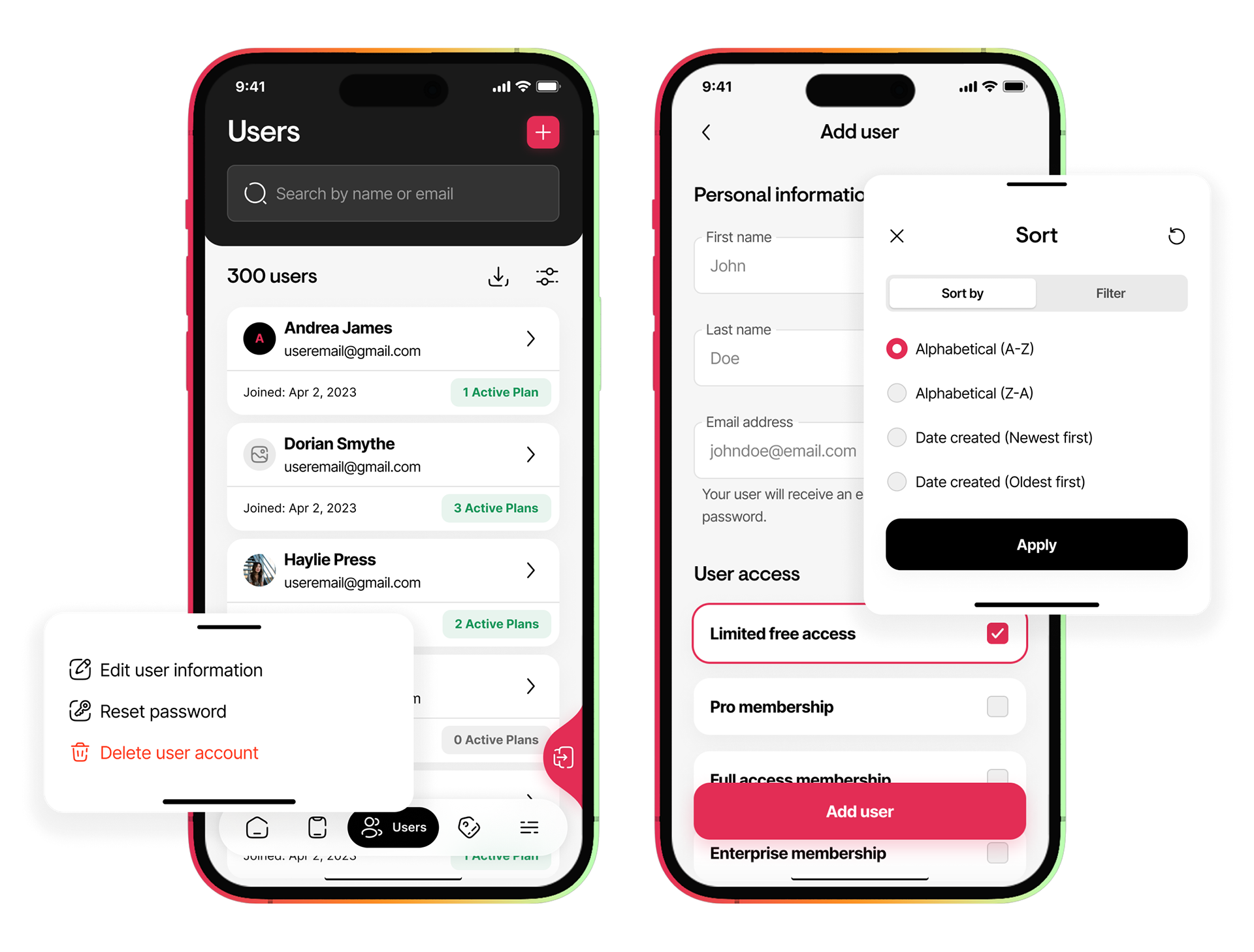
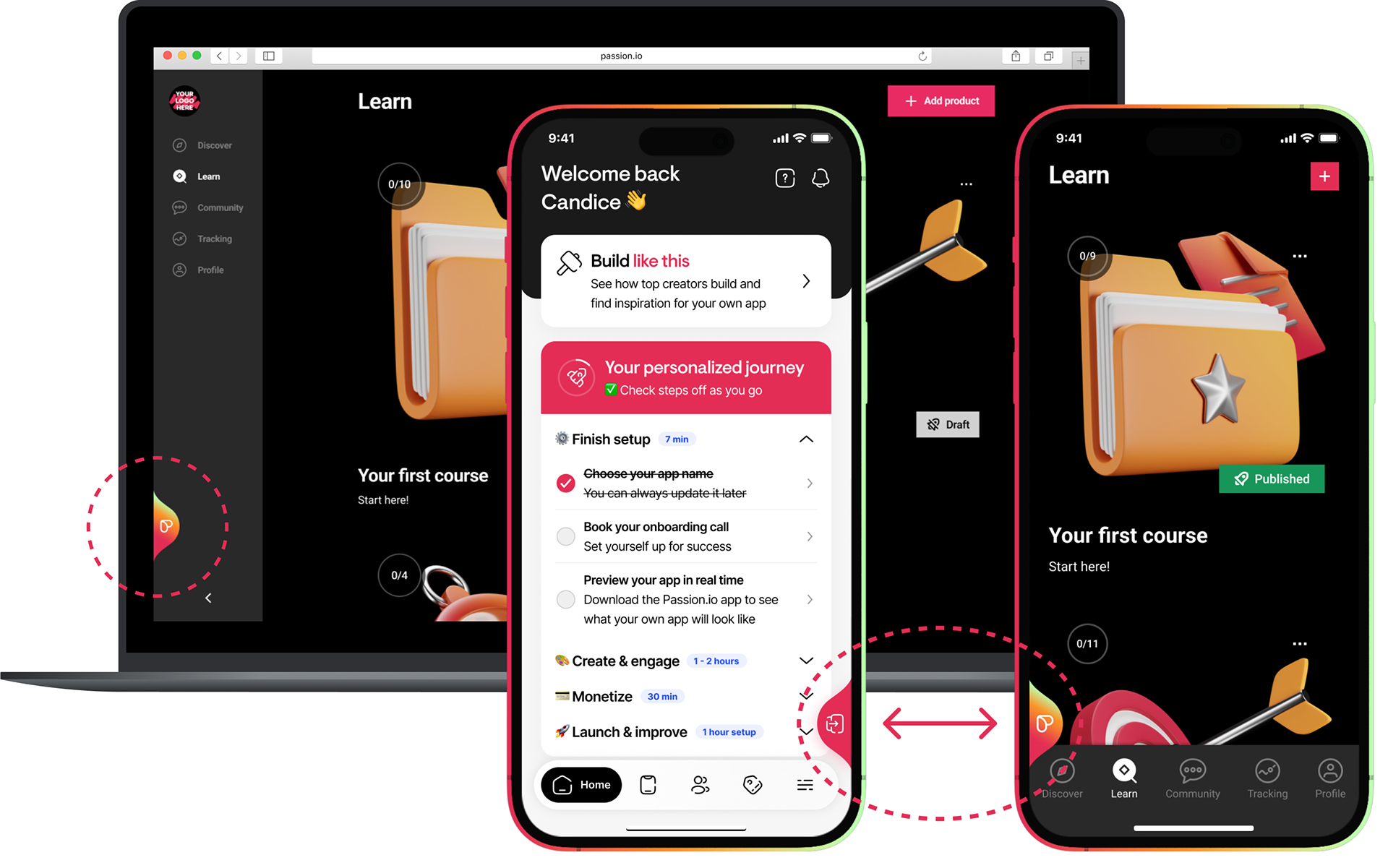
Passion.io is a no-code app builder platform that enables coaches & creators to build their own app for iOS, Android and web. You can include courses, communities, and interactive features, all from your desktop or on-the-go from your mobile phone.
My responsibilities included, but were not limited to, building and maintaining two separate design systems, conduct user research, do user testing, design the UI for both mobile and desktop apps, improve the core product platform UX, design new features, validate and test features, work on monetisation/growth design opportunities, gathering data insights and make informed decisions.
Project Scope
While I worked on numerous different projects at Passion.io over the years, the one I will outline here is the main app builder platform rework. I collaborated with other designers on my team, and together we delivered the brand new admin app builder platform designs.
NOTE: due to NDA I can only share limited insights about the project here.
User needs: Better and more intuitive navigation, improved feature sets, ability to build from anywhere (mobile & desktop), mobile-first approach.
Main problem: The way the previous app builder platform was built resulted in it being difficult to maintain while simultaneously making constant feature updates. It lacked the necessary structure, the navigation hierarchy & logic was very difficult to use, had a very limited feature set, and worst of all, it was not built to be responsive. At all. Users were limited to only using it on desktop and could not access/view it via mobile.
End users and core target market: Passion.io customers (creators & coaches)
Platforms that were designed for: Native iOS & Android, mobile web, desktop web
Key improvements:
- More intuitive navigation
- Better building tools
- Mobile-first approach
- More modern UI
- Ability to use it on both mobile & desktop with ease
- Overall UX improvement to logic and information hierarchy
- More intuitive navigation
- Better building tools
- Mobile-first approach
- More modern UI
- Ability to use it on both mobile & desktop with ease
- Overall UX improvement to logic and information hierarchy
Screenshots of previous app builder platform UI
Process & Solution
The previous app builder platform was evaluated and the features that needed to be improved, removed or added was outlined. For the navigation issues, we conducted user research with some of our customers (creators) to get insights into which areas they struggle to use or navigate, and what their current goals were that they were trying to achieve by using the platform. We did card sorting exercises during user interviews with the creators to discover how they logically group and approach the current features and pages.
Once we gathered as much information as we could from interviews, we started designing a few concepts. We knew we wanted to update the UI along with everything else, so we brainstormed a few quick options. We presented it to the stakeholders and, after some feedback rounds, made the final version that used for development.
With new UI comes a brand new design system! I collaborated with the other designers to build the new system components and set up styles to maintain consistency and ease of use for both designers and developers.
Snippet of some rough wireframes we created
Examples of components I created for the one design system
Once the basis of the new design system was ready, the biggest part of the project could start - designing the new platform for both mobile & desktop.
We went through a few concepts to determine the best solution for the layout and structure. Ultimately, the team decided it would be best to keep the layout of the main options area on the desktop view the same as mobile to reduce development scope and shorten future release timelines.
Each area was designed with care, going through various review rounds internally to ensure all stakeholders were happy with the direction. Everyone from the tech team, customer support and management was consulted until the final designs were approved and handed over for development.
I was involved from start to finish. Everything including writing tickets in Jira, supporting development when they had questions, testing during QA, and creating the supporting social & email assets for the big launch.


Outcome
The launch of Passion.io's brand new App Builder platform sparked both positive and negative feedback. The majority of customers were praising the new "edit on-the-go" capability, while others did not like the change. In general, change is always a big thing and people rarely like it (remember how negative people were when Slack updated their UI?). Ultimately, our customers had a better user experience, which was evident by the reduced number of customer support tickets for platform guidance/assistance. It was a huge step forward in making the product more intuitive and powerful.
But we didn’t stop there. Over the next few months, we kept the momentum going, rolling out updates based on real user feedback. We fine-tuned performance where needed, added more features, and made the platform even more reliable. The result? A tool that’s not just better → it's a game-changer for Passion.io's customers!